We went to the Dixie Classic fair this week. It’s huge; the 2nd largest in North Carolina. Since moving to the US, we have become addicted to “fair” food.
You know; all the traditional and non-traditional deep fried, candy-coated, treats that are rarely offered anywhere else. Except the Fair.
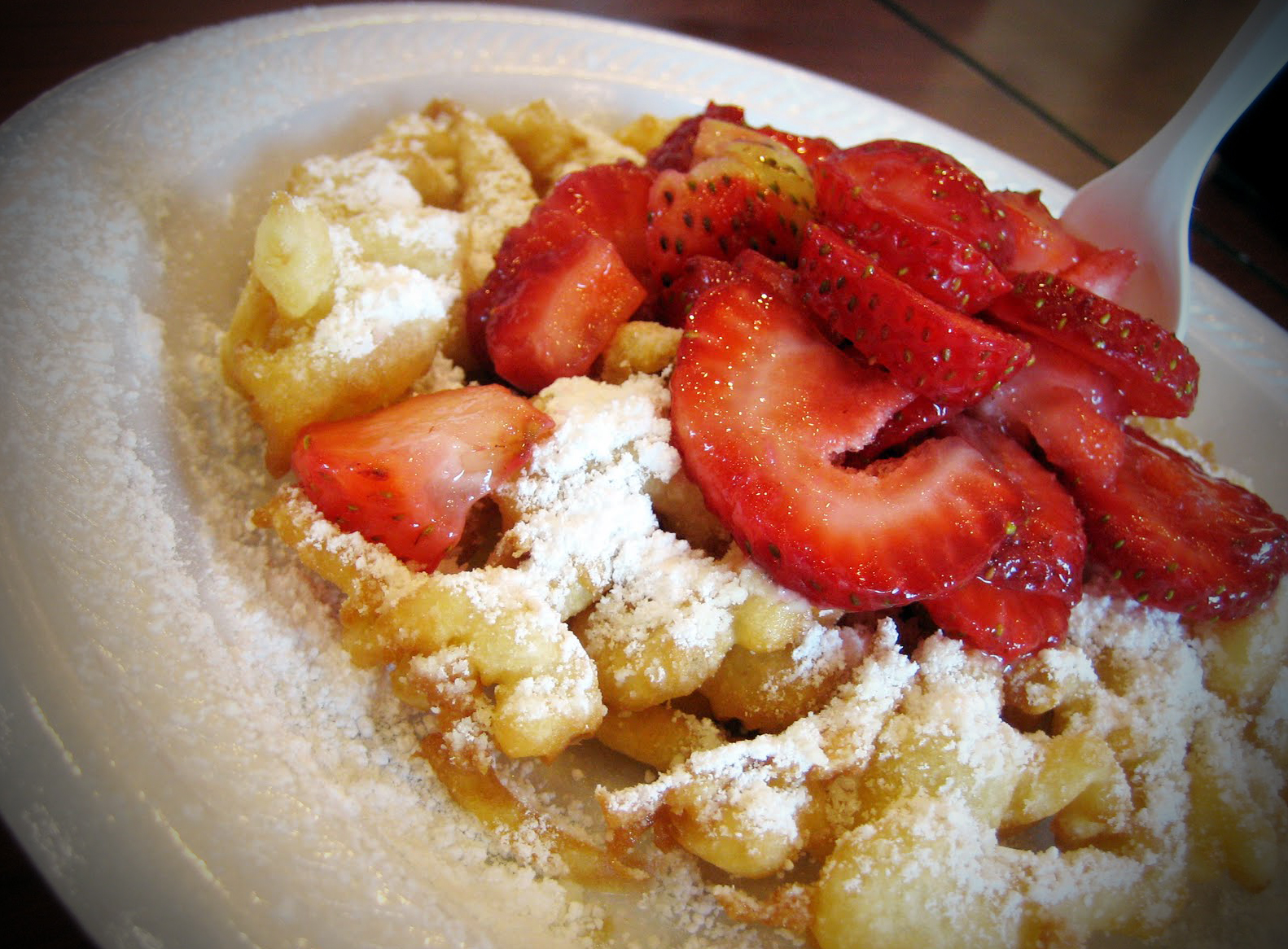
Funnel Cakes
Krispy Kreme Hamburgers
Candy Apples
Cotton Candy
Ribbon Fries
Pork Chop Sandwiches
Cheesecake on a Stick
After wandering around the fair grounds looking to see what’s new (and engaging in some serious people watching), we decided how we’ll divide our calories. We choose a trailer or two to buy our meal from. It’s the only time of the year I would ever eat out of the side of a truck. Somehow at the fair, it seems normal.
Did you know that your company is like the mobile food truck?
Almost 50% of people will want to go to your website. They’ll pick up their smart phone and start to browse. If you don’t have a mobile-friendly website; the latest statistics say that 60% will leave your website.
What do you need to make your website a “mobile-friendly” website?
- Buttons/Links that are easy to touch with thumbs
- A simplified homepage that directs people on a small screen
- Edited, simplified copy for those who want “just the facts”.
- A quick and easy address or phone number that can be selected for directions or a call.
It can’t look like a traditional desktop or you will lose the chance to sell or inform to them. It’s that easy.
This trend is increasing. It’s truly time to convert your website to a mobile site. And I need to start dreaming about my visit next year to the fair.